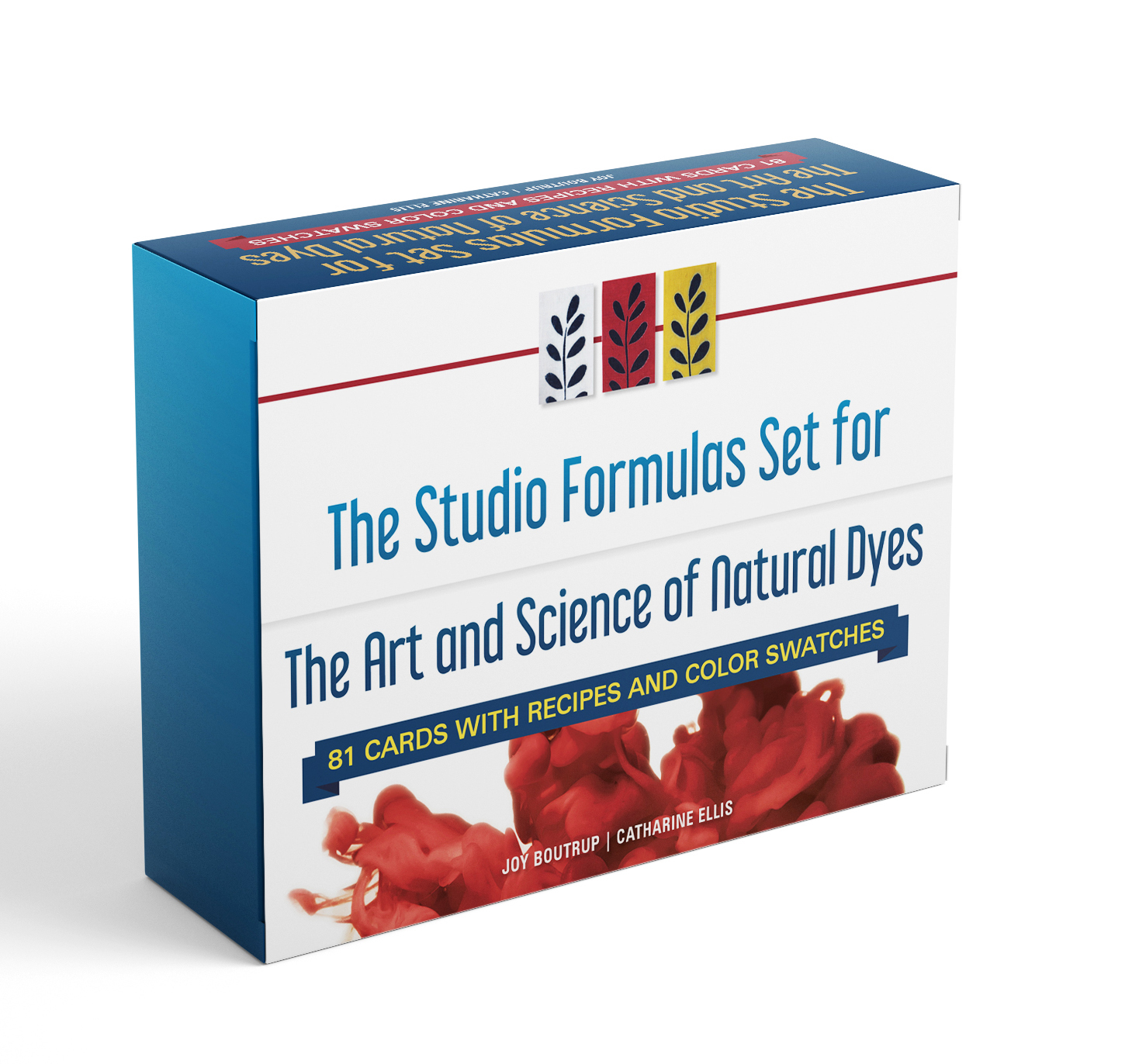
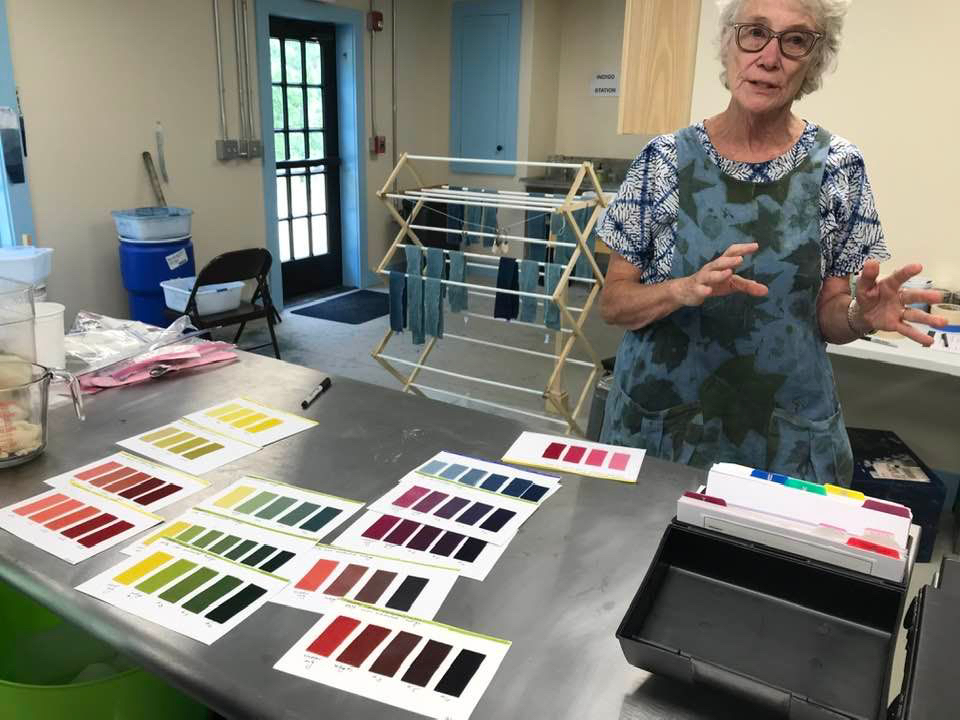
It’s been a busy summer, but it’s time to follow up on my earlier post about the recently released Studio Formulas Set dye recipe cards. I received my own set of dye and recipe cards from Schiffer just before Joy Boutrup arrived from Denmark for a class we taught together at Penland School of Crafts in June. Teaching together was a great opportunity to receive some feedback about the set.
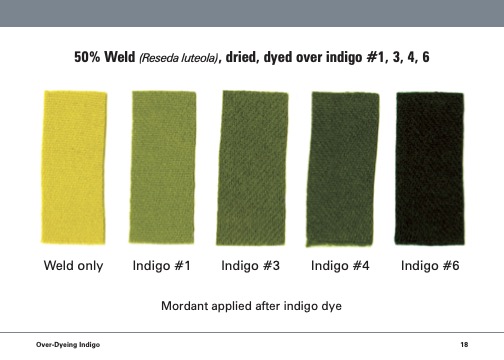
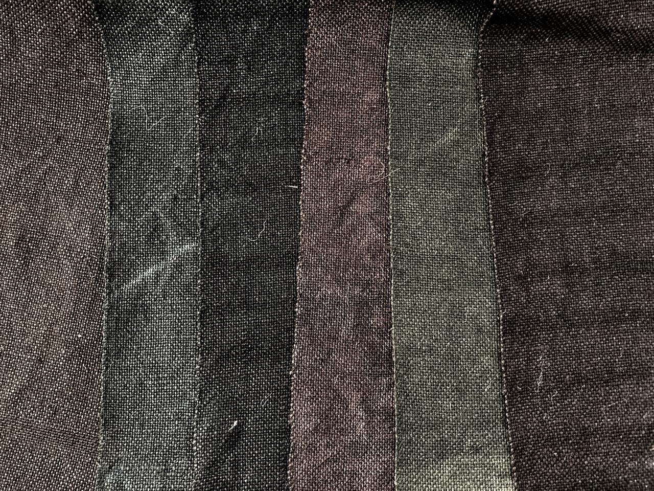
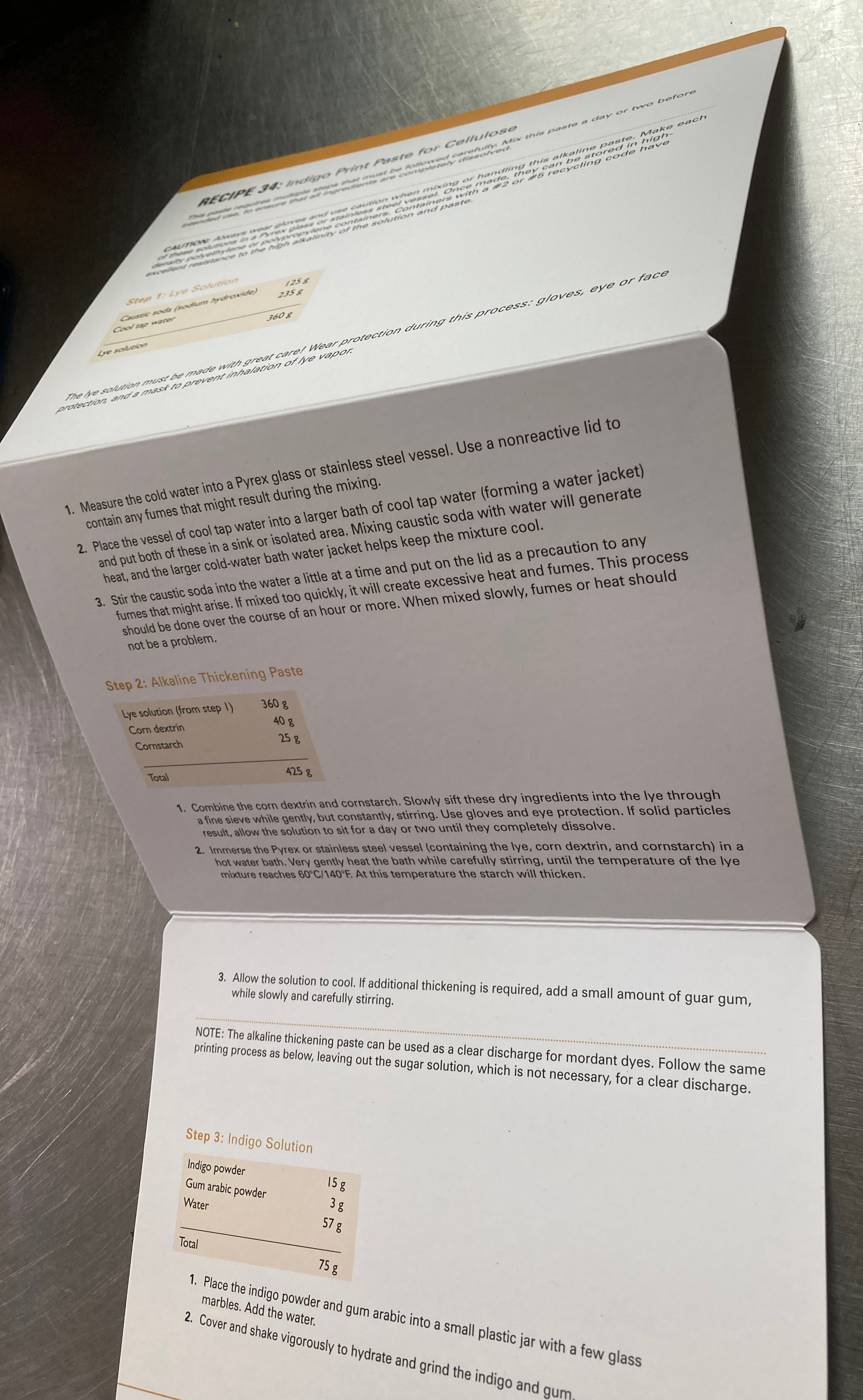
Every recipe from the book is represented by a single card. Additonal colored cards illustrate individual dyes and color mixing. We opted to use wool as “the fiber of choice” when creating the initial printed cards as it such a commonly used fiber. The dye cards in the collection document the most important dyes: indigo, madder, cochineal, and weld along with a couple other tannin based dyes.
The dye color cards are beautiful and just as I had imagined they would be. Schiffer did a superb job of reproducing my dyed wool samples in print. Color matching is perfect! I was told that it took several tries to get it just right. I can appreciate that kind of care and accuracy – the same care and precision that I put into my dyeing. Although the cards are durably coated, it is easy to write on them with a ball point pen or ‘Sharpie” and there is room for personalized notes on the back of each card.
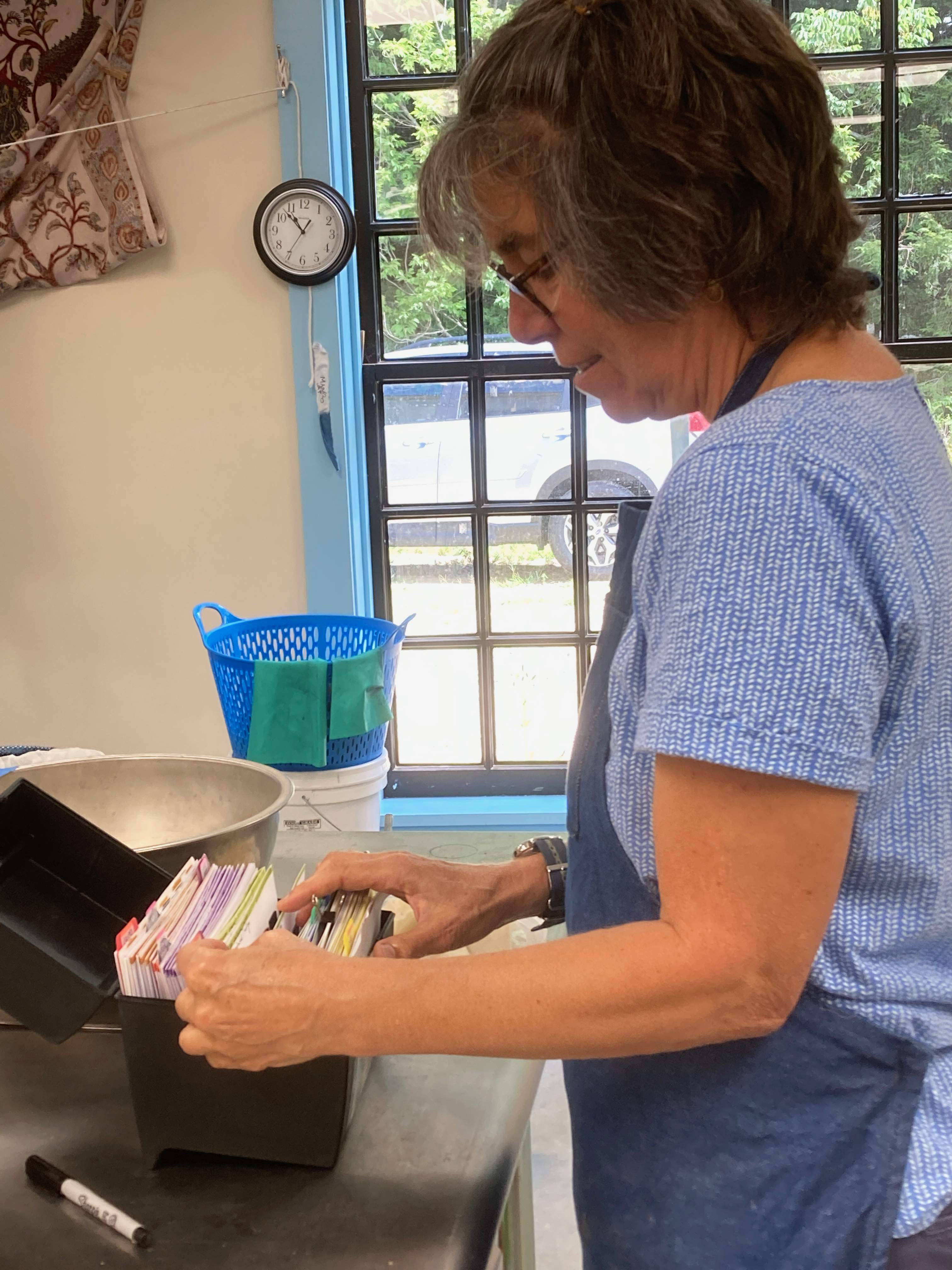
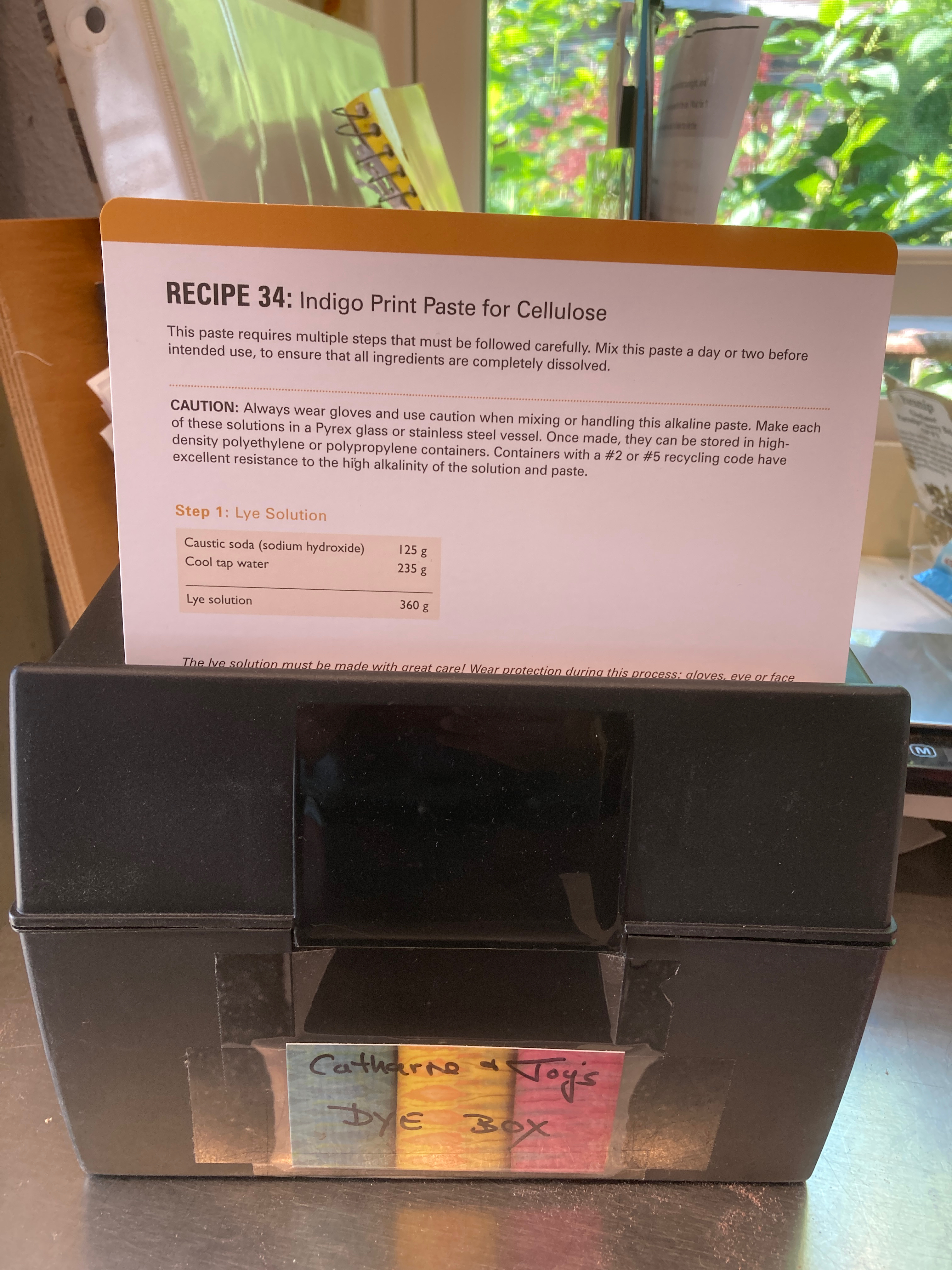
The cards come in a box that is custom made for the set. It even has a magnetic clasp to keep it closed. BUT for me to get the most use out of the cards, I removed the cards from the original box and placed them into a much larger file box. This allows plenty of room for flipping through the various recipe cards, adding tabs for easy reference, AND for adding my own customized cards to the collection. You might want to do the same.
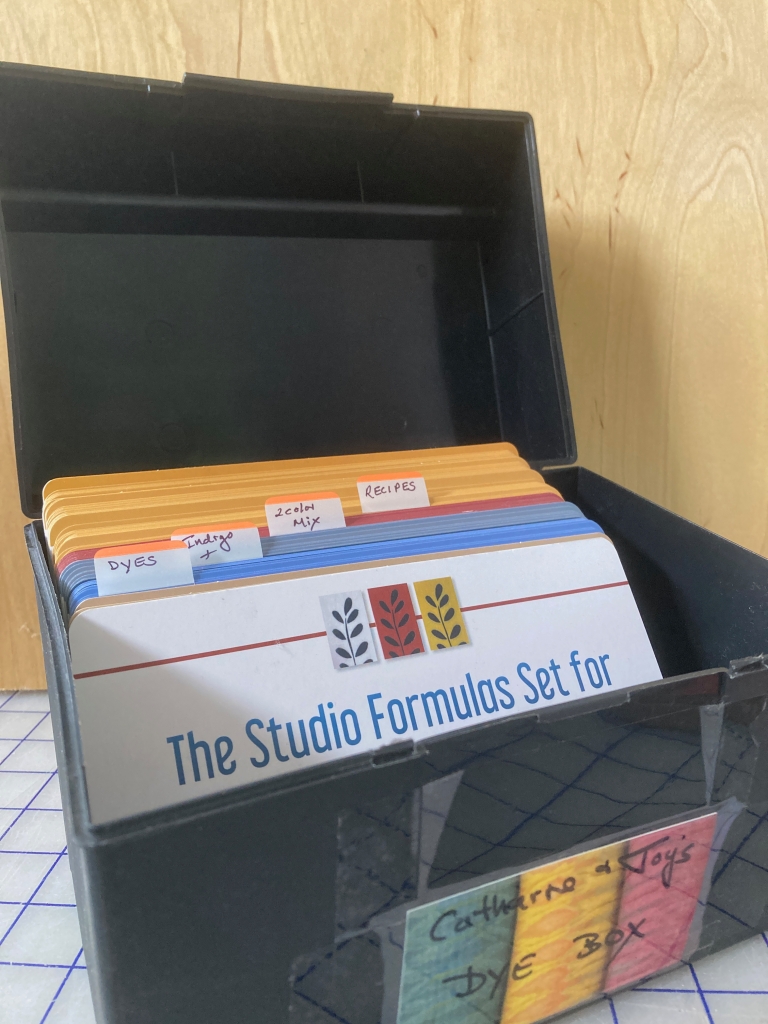
Studio Formulas Set moved into a plastic file box, purchased for less than $10, with lots of room to expand.
Having individually printed recipe cards is proving to be very convenient in my own dye studio. Instead of dripping dye all over my book, I now can pull out the required card and work from that. And, YES, I do use the recipes from the book and I don’t have every one of them memorized!
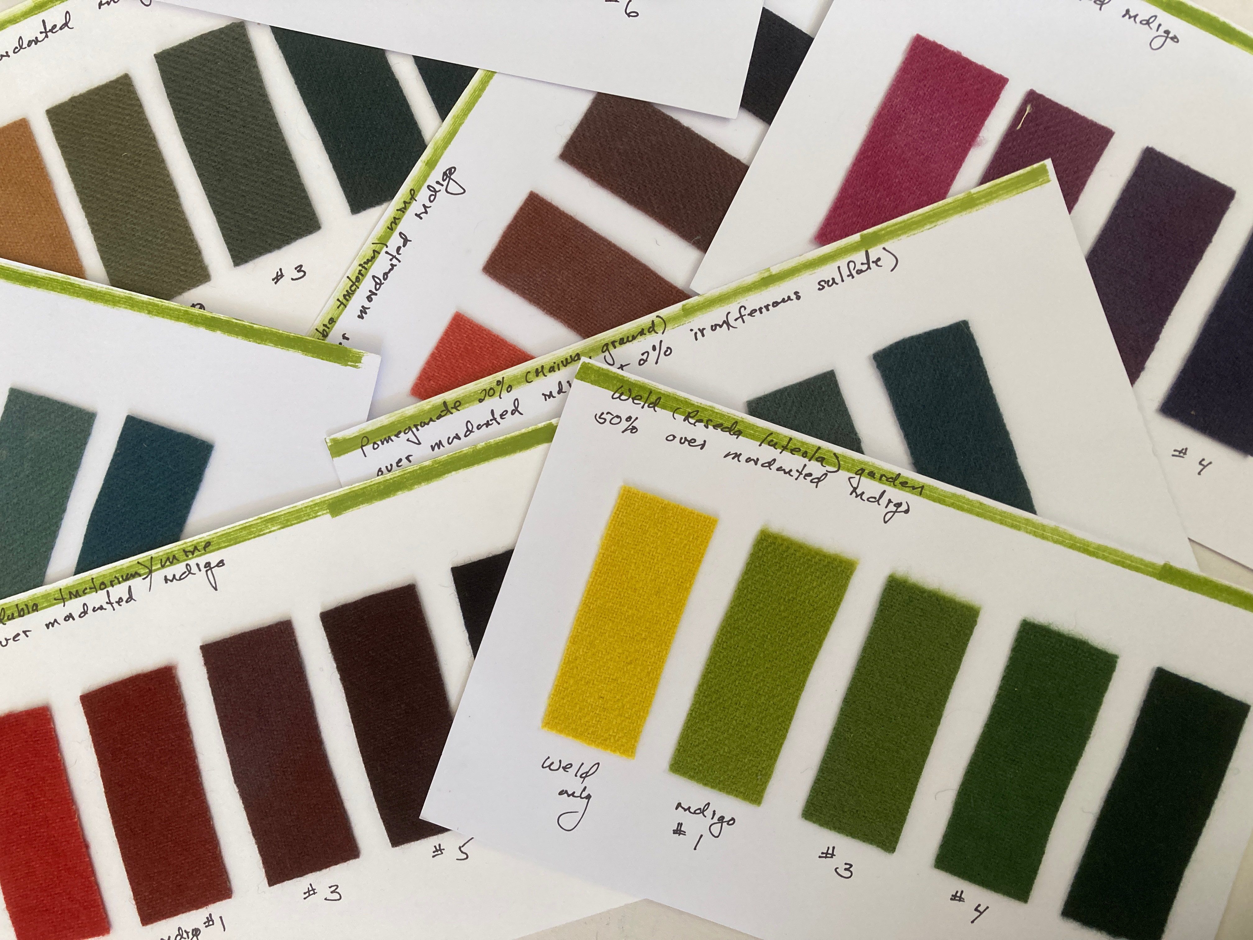
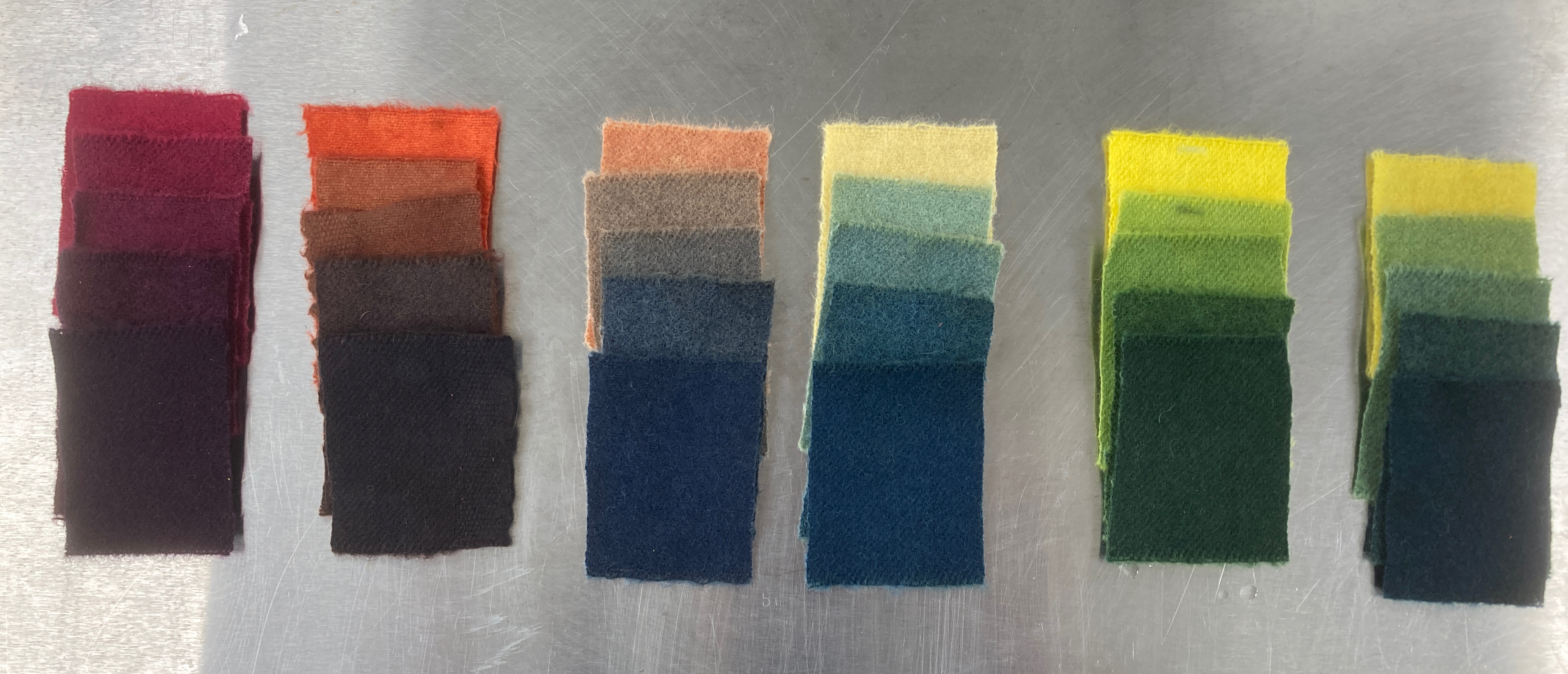
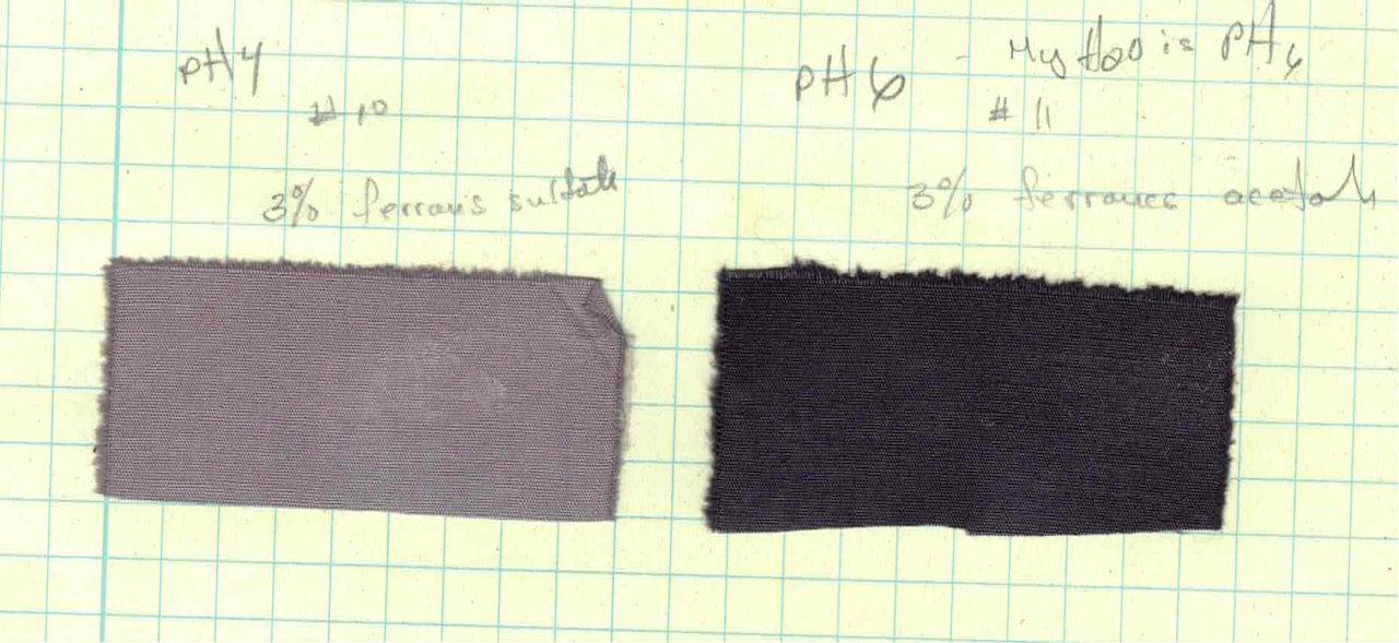
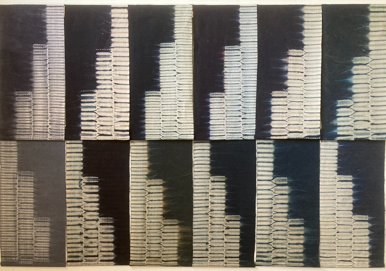
The use of cards containing easily referenced materials and samples has changed the way I work over the last several years. As you know, I am seemingly always testing dyes and process. Once I complete an initial set of tests (recorded in detail with samples in my lab notebook), I then mount the final samples on a card, filed for easy access and reference.
Here is a great example of how useful this process can be:
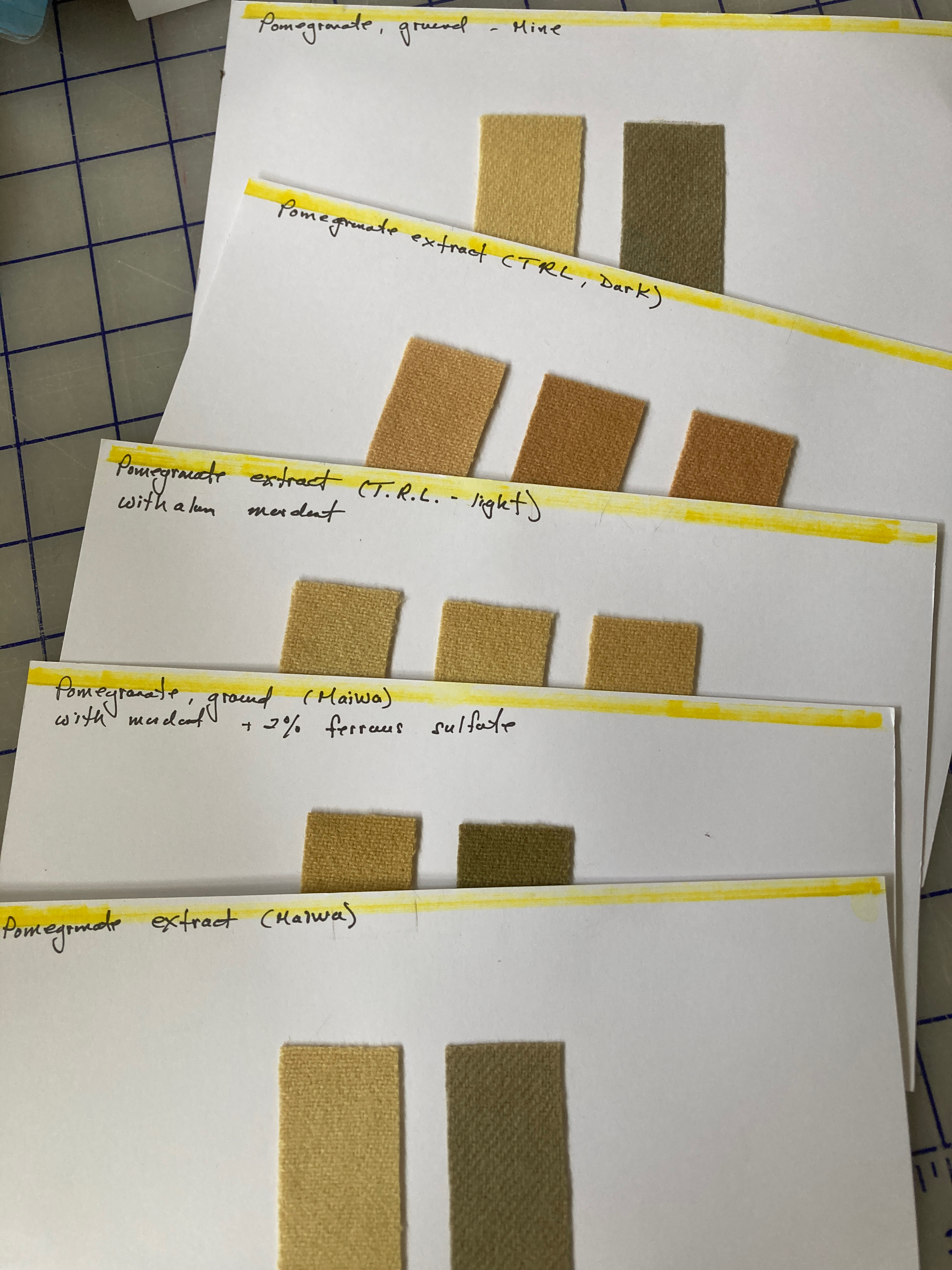
I recently I went to my dye shelf to look for pomegranate rind for a specific dye project. I found that I had 3 different extracts and two jars of ground pomegranate rind (including one that I had ground myself). Were they different? the same? After making samples of all the various pomegranate dyes (on both cellulose and wool) I can now objectively see the subtle differences between each of these dye sources and make a better informed decision.
Having of a record on hand of the dyes in the studio is an essential discipline that takes the guess work out of the dyeing process. Whenever I obtain a new dyestuff (purchased or grown myself) my goal is to complete a test dye on the appropriate textile material. Sometimes that means dyeing several samples as I explore various depths of shade on different fibers.
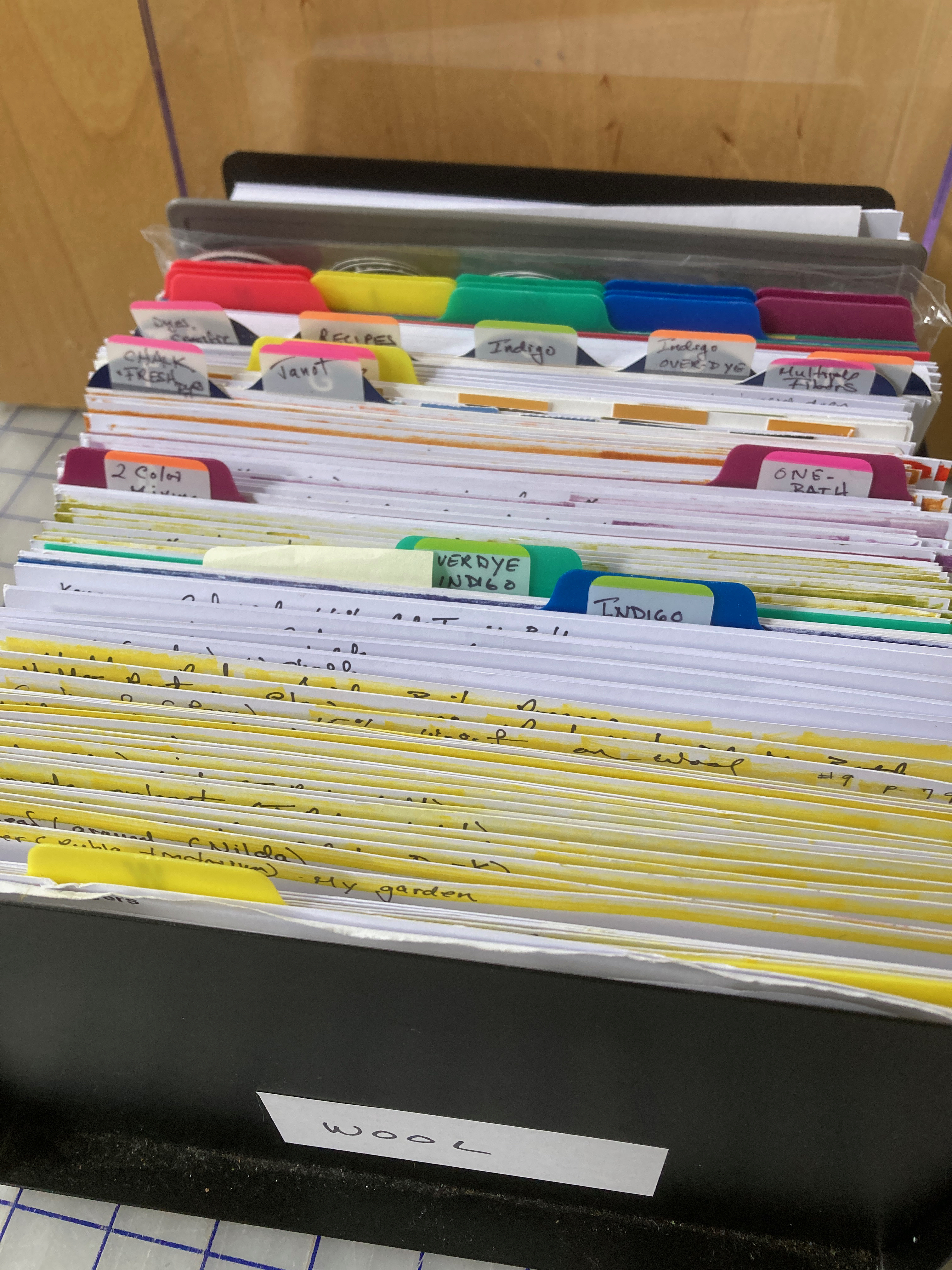
If one chooses to add actual cloth/fiber samples to the box, available space fills quickly. Thus, a larger, file box quickly becomes a necessity. Currently I have one box earmarked for documenting protein fibers and am building another that is dedicated to cellulose.
Careful measurement of the dye used per weight of textile can result in greater control over the palette of color and discourages wasting of dye. It has the potential of bringing natural dye to a level beyond experiment and discovery: controlled color.


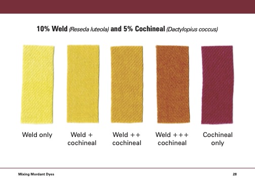

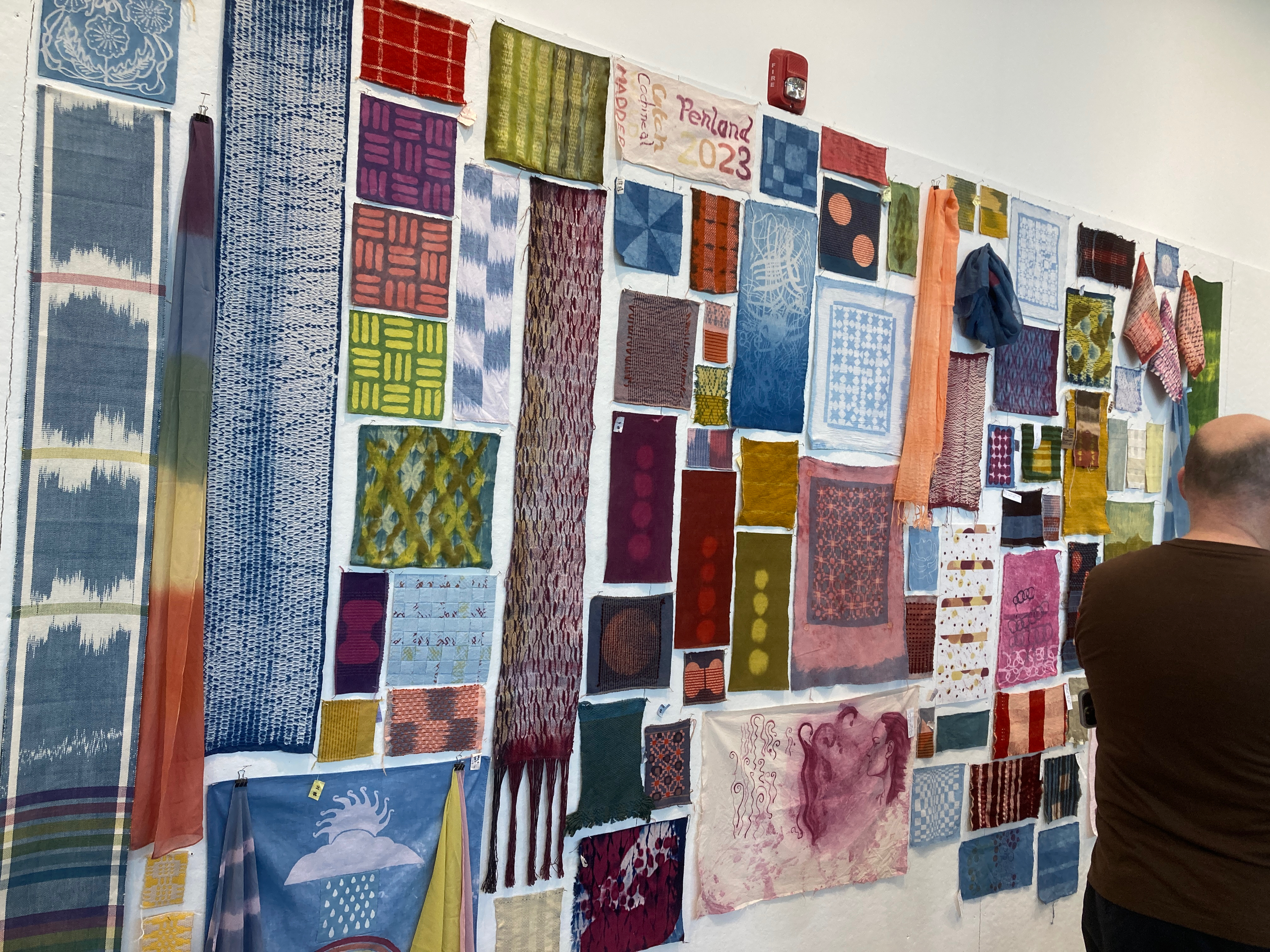
When Joy and I taught together at Penland in June, we used the cards throughout the session as a quick reference for dyeing in the class. By seeing (and understanding) the function of color mixing with natural dyes, students were better able to predict the colors that they would ultimately achieve. I am sure that you will also find them a useful tool in your personal studio practice.