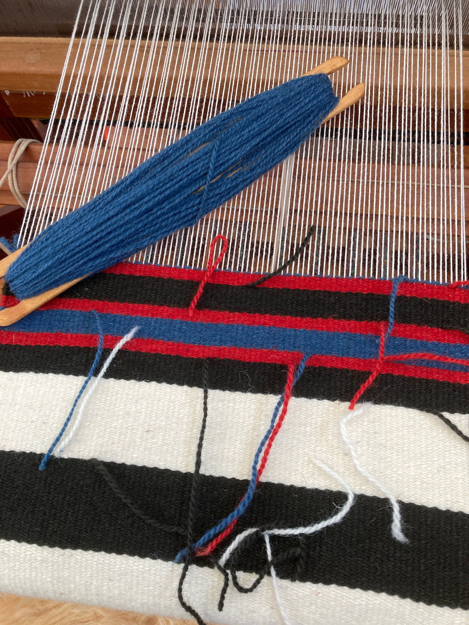
I recently took on a small weaving commission that required the use of black wool yarn. For a brief moment I contemplated purchasing the wool in the required color and then decided that I could dye it. I was surprised at how easy it was to achieve a rich, deep black color on the wool using only indigo and madder.
It inspired me to continue my current series of color studies, woven in cotton and linen, with an in-depth exploration of black dyes.
Initially, I wanted to achieve all the black hues without the use of an iron mordant. My years of mixing hues with primary colors gave me the confidence to believe that I could mix a good black for cellulose using 3 primary colors: blue, red, and yellow. The key was going to be finding the correct proportions.
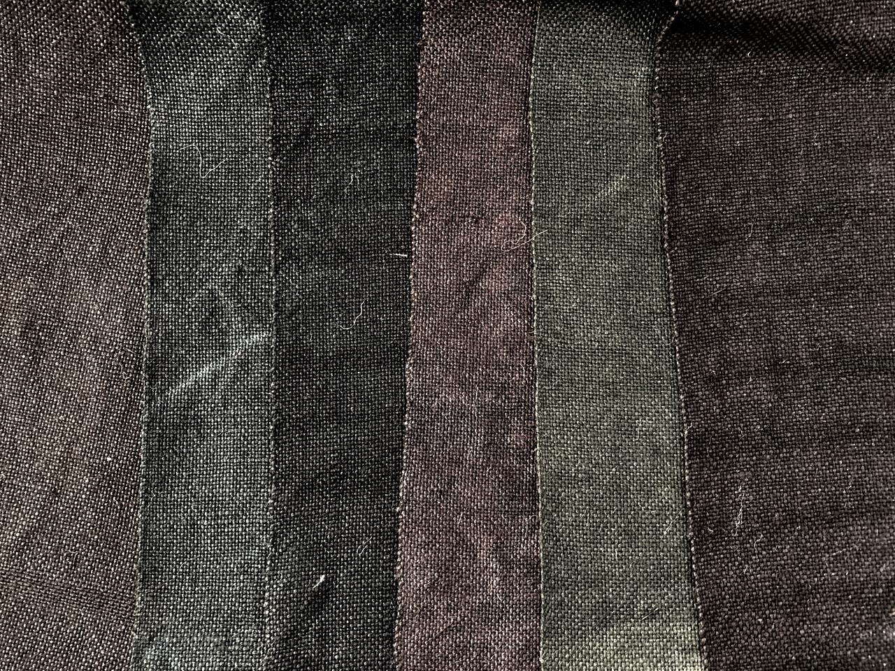
The first step was to build up a deep layer of indigo blue (usually 8-10 dips in the vat) followed by a mordant, and finally red and yellow dyes. That red could be madder or cochineal but I chose to use only madder, since that is what I am growing in the garden. My preferred yellow is weld. Each different combination results in a subtle variation. Some “blacks” are more purple, while others are a bit more green, or brown. I began using black walnut and cutch as a substitute for the madder and weld and sometimes added madder or weld to those. Each is a distinct hue, and definitely in the “black” family. I am confident of the lightfastness of these hues because of the primary dyes that have been used.

These multiple shades of black, put me in mind of the paintings in The Rothko Chapel in Houston, which is the site of a series of large large “black” canvases by the artist, Mark Rothko. These black canvases are painted with layers of crimson, alizarin, and black.
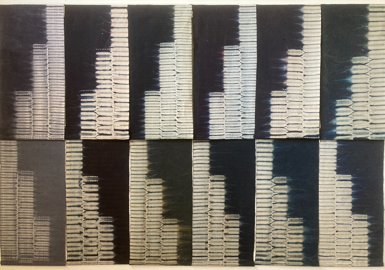
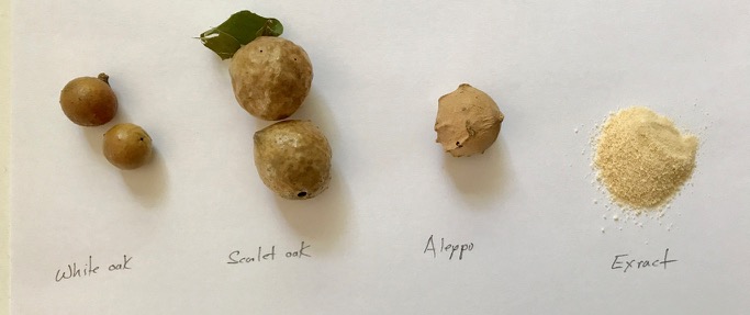
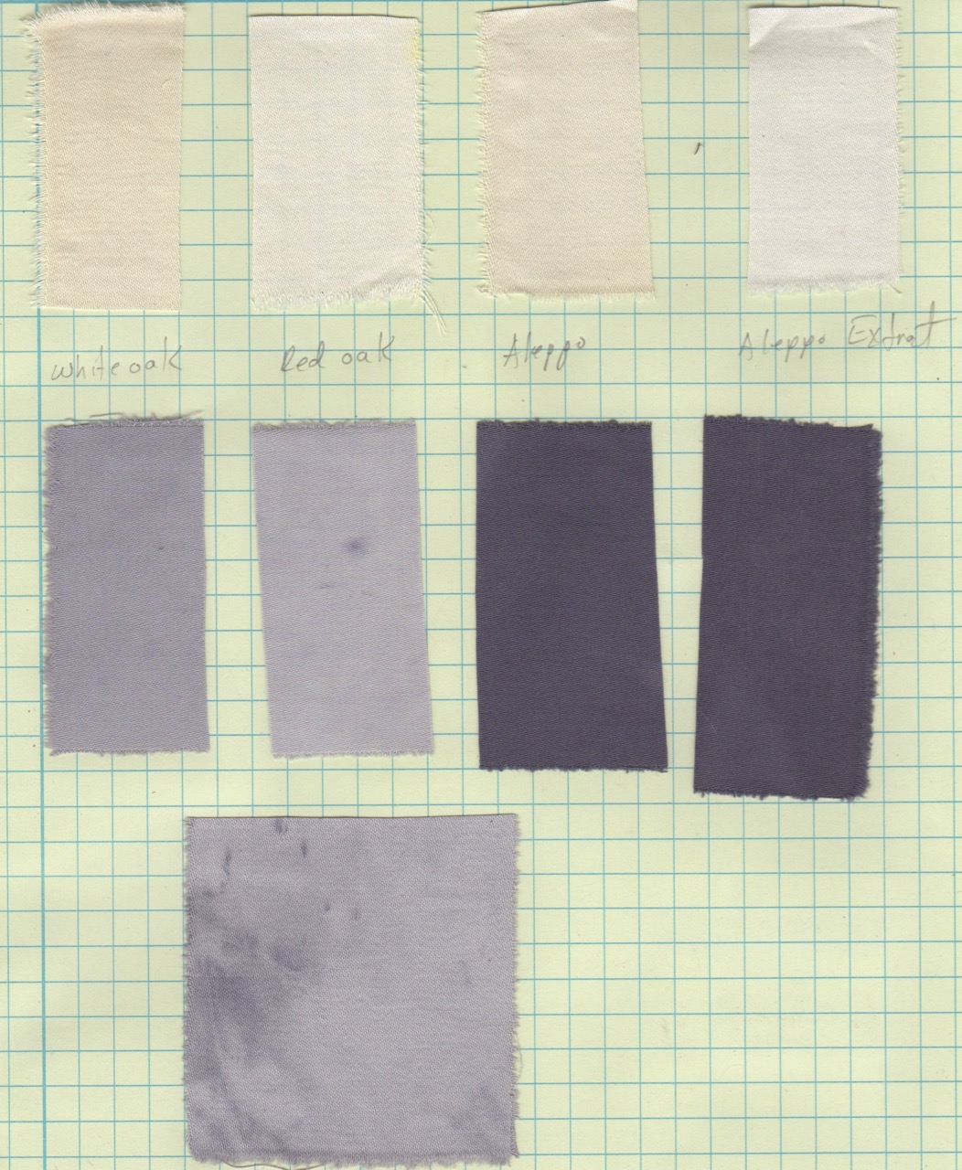
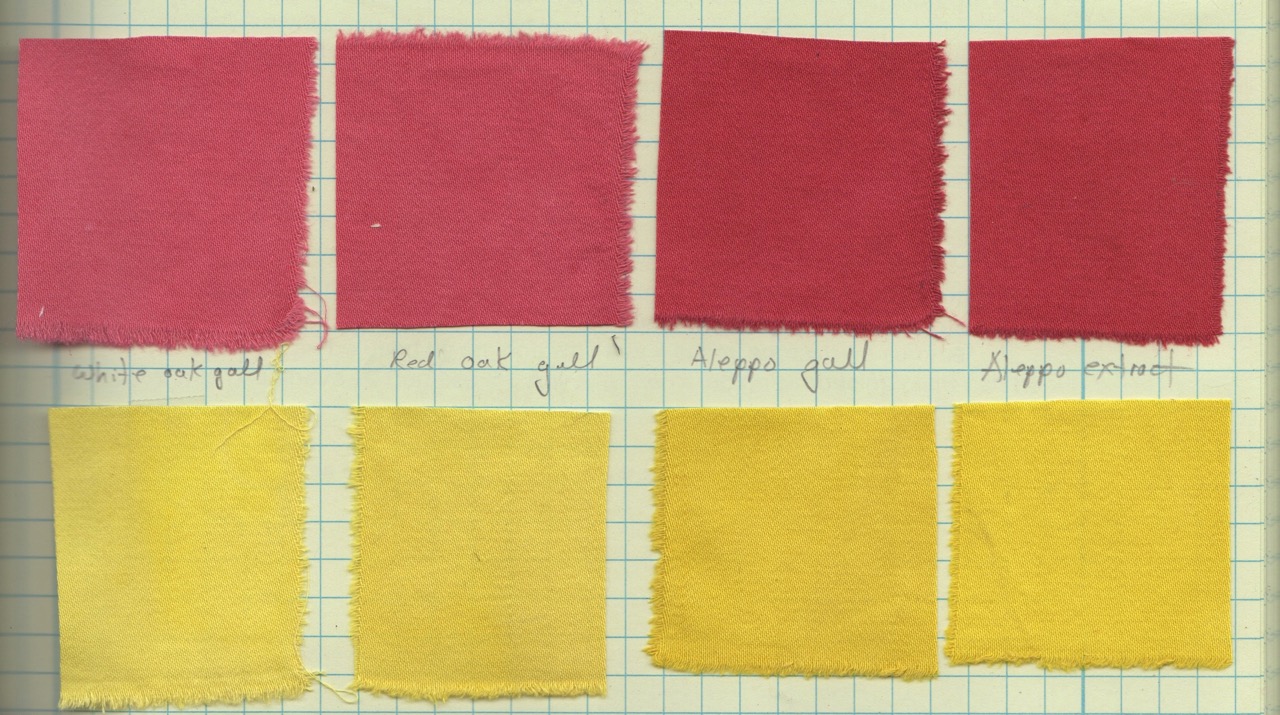
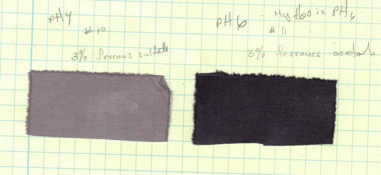
But no exploration of black would be complete without some experiments using tannin and iron. Instead of building up layers of primary colors, I soaked the textile in a gall nut tannin bath, followed by a short immersion in an iron bath. I wanted to use as little iron as possible, but still achieve a very dark shade. I decided that 3% weight of fiber would be the limit of the amount of iron I would use.
Most often, I use ferrous acetate instead of ferrous sulfate because it is less damaging to the fiber. Cellulose fibers are are somewhat tolerant of ferrous sulfate so I did experiments with both. That is where I was most surprised! Without exception, the ferrous acetate resulted in deeper colors than the same amount of ferrous sulfate.
Why? I wasn’t sure. So I consulted my colleague, Joy Boutrup, who always knows these things.
“I think the reason for the grey instead of black with iron sulfate is due to the higher acidity of the sulfate. The acetate is much less acidic. The tannin complex cannot form to the same degree as with acetate.”
The pH of my ferrous sulfate solution was 4. The ferrous acetate was pH 6. (My tap water is from a well and is a slightly acidic pH6.)
The grey and blacks achieved with the tannin and iron are quite one-dimensional compared with those that result from a mix of colors and not nearly as interesting, Yet they are likely a more economical approach to achieving black; the multiple indigo dips, mordanting, and over-dyeing takes considerably more time and materials than an immersion in a tannin and an iron bath.
Always observing always learning, here in the mountains of North Carolina…